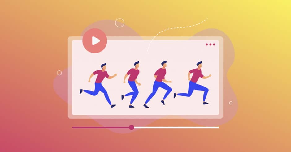
If you want to have an effective selling resource on the Internet, be sure to think about animation for websites. This little addition not only makes web pages more beautiful and stylish. Proper implementation of website design animation allows you to effectively guide the user through the sales funnel. This will significantly increase your conversions. Also web animations help to quickly attract attention and make the brand more recognizable. It is very important to use only the latest front-end technologies. Otherwise, the page will take too long to load. This will scare off most visitors. The main goal of animations for a website is instant loading. To achieve exactly this result, you need to contact an experienced developer.
Web animation techniques
You can integrate animation with the site using:
- HTML code;
- CSS code;
- JavaScript code;
- Gif animation;
- Flash animation.
Videos come in many different forms, and there are many ways to connect with your brand’s audience. In today’s world, animation is one of the most popular ways to tell a story to marketers.
Website animation effects
Improving usability with animation
In many cases, animation effects are used to draw the user’s attention to important details. They are also used to emphasize the clickability of an element against the background of other things.
For example, many sites use the button shake effect to alert the visitor of an error when entering a username or password. This animation mimics the human head-shaking gesture of denial.
There are many other ways to use animation to improve the usability of an interface. For example, it can be included in navigation elements to separate categories from subcategories, or in multi-selection, when all elements except the selected one disappear from the field of view.
Expanding existing marketing materials
Animation in web design is extremely useful, unless it is used purely for decorative purposes. Interface designers now often use animations to enhance their workspace. Even Google understands the importance of having moving elements for usability. Actually, this is how Google’s “Material design” appeared. Material design is becoming more and more fashionable. Today it is used in various applications and in website design. The secret of its popularity lies in the increased attention to how the element will be perceived, how movement can tell users more about what the element is and how to use it.
When implementing animation effects on your website, you should carefully consider all the pitfalls associated with using them. Animated elements can still hinder website performance and user experience.
Use CSS when creating animations for your website. jQuery is ideal for many scenarios and is ubiquitous, but it can actually hinder your site’s performance. The CSS code allows you to create lightweight animations that look great on any device without cluttering the design and giving a high level of website performance.
Animations should be eye-catching, but not over-the-top. Make sure that the movement in the animations does not take too long or take up the screen area for too long. This is especially important for elements with which users will interact very often. For a couple of times it can entertain them, but then it will simply start to annoy.
Mobile version
An experienced developer will definitely suggest transferring animation from the site to a mobile application. This will further increase brand awareness. Note that when developing a mobile version, the animation should behave the same as in the full version for browsers. This has become especially important in 2020, as more than half of the traffic comes from smartphones.


